
Mechfight Remake
Prototyping the UI

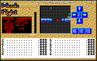
I spent some time working on the UI - there wasn't too much in the original game here: mainly it was what I am calling the "console" - the text area at the bottom of the screen where the messages appeared - and a few other embellishments.
Typically the wide aspect ratio of the console really suits text - it allows long lines that are easy to ready without wrapping, but the original game only had this teeny-tiny little window to see the game world in so it had lots of space to play with on-screen. Today in 2018 we're not so limited and could easily go 100% fullscreen with the game world if we wanted, but then where do we put the console and other UI elements?
I wrangled with myself a bit on this - for now I've opted to retain the square-aspect of the original, and put the console and other UI bits on the side of the screen:
Original | Remake UI prototype |
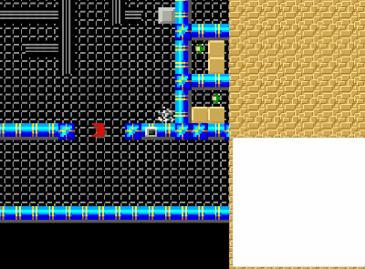
There is something appealing about the square-aspect of the game world that just feels right - both in deference to the original's design, and also as a reflection to the tile-based nature of the game. I'm not 100% happy with this yet though - something about the small console is just jarring (...but perhaps that is just me being used to 80 columns or more?).
Some alternatives that I may still consider:
- Create a "L-shaped" UI with a low-height full-width console along the bottom of the screen, with the other UI elements at the side of the screen. This should allow me to retain the square-aspect.
- Just bite the bullet, give up on the square-aspect and have the UI + console along the bottom and a rectangular game world above it (hopefully managing to stick to a 16:9 ratio for the game world so it is at least pleasingly shaped)
I'll probably leave this prototype UI in place while I implement some of the other game logic (e.g. more of the "dialog" sections where you need to respond or enter a password) and see how it soaks in.
Watch this space.
As an aside, I have been spending a fair amount of time trying to decide how best to structure the UI code. Previously each "message" entity in the game was responsible for announcing its own messages to the console. This was great initially with just debug logging as each entity was nicely encapsulated with low coupling, but getting those messages into the UI presented some decisions about how to avoid spaghetti code from flourishing too much.
For now I have refactored everything so that the main "controller" class (i.e. the class that takes the player's input and moves the character around) to use a standard "Observer" design pattern so that whenever the player touches a "message" entity the controller informs all observers that something has happened. At the start of the game the console registers itself as an observer of the controller, so it gets informed when something like a message has happened and so can display it in the UI. This approach was mainly needed as I needed the controller to know when it should disable movement and wait for dialog inputs (e.g. wait for a y/n/escape key if the user walks into a "Do you need help? [y/n]" entity, or a "Enter the password" entity etc). This works great, but now there are other things I want to put in the console - specifically the "The laser door opens" messages that appears whenever you go through a laser door. Having the console be an observer to every single laser doors' events feels utterly wrong, yet tying these door messages back to the main controller, that then announces events, that the UI then picks up on and displays using this Observer pattern also feels like I am doing a Bad Thing here too. I may just end up making the UI classes static and have any game object call those static methods - this is after all essentially what the debug logging did with Debug.Log.
Leave a comment
Log in with itch.io to leave a comment.